Blog Archives
What Happened Today at the Monastery?
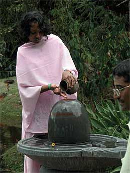
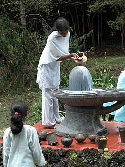
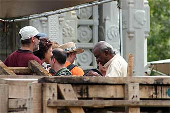
It was the last day of our phase and the Aadheenam was humming both dedicated pilgrims and casual end of phase visitors, in fact three monks were hosting all morning and still we did not catch everyone… Bodhinatha enjoyed some excellent darshan sessions with devotees from Canada, UK and other locations.
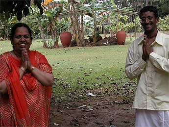
Ramalingam and his wife Hema are here from Vancouver. They knew Gurudeva and met him several times in Concord. He and his wife discussed with Bodhinatha and sought his advice on the Ganesha temple in Vancouver. Ramalingam occasionally helps with pujas there.
END OF PHASE
Today is the last day of our phase.
This edition of TAKA will remain posted
over our coming two-day retreat,
until Dasami Tithi, Sun One, Sunday, August 28th.
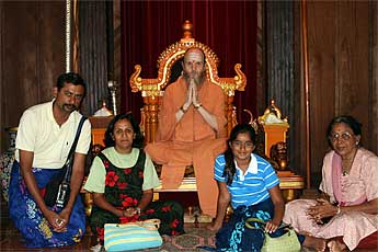
Virendra Patel and family from southern California were among our many guests that came today. They had a wonderful meeting with Bodhinatha asking
many insightful questions.
Mr. Prasad with his wife, daughter son and their grandmother. The elder lady asked Bodhinatha many insightful questions.
She has some good insights on teaching very young children. For example, she suggests that they not be exposed to the Ramayana and Maha Bharata at too early an age as they are not able to interpret all the violence in those stories.
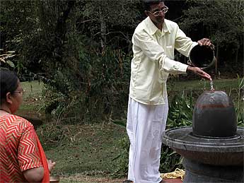
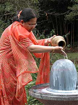
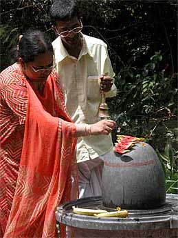
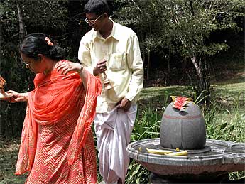
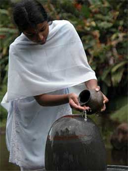
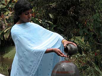
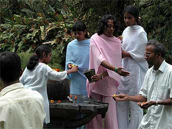
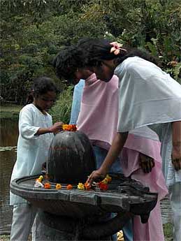
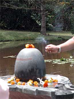
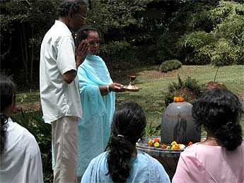
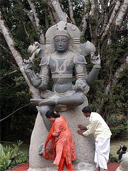
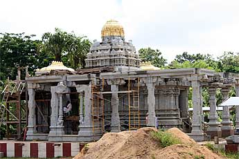
Ramalingam and Hema at the Narmada Lingam on the path of the Saiva Saints.
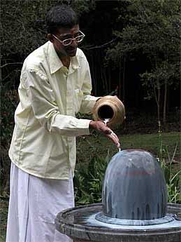
Off to worship Lord Siva at the Path of the Saivite Saints….
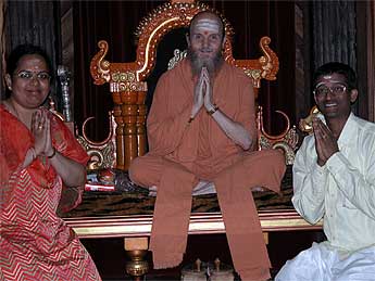
This is the Puvanendran family from London.
Sadhaka Dandapani is planning out the final details for the Innersearch. With only about 4 months to go many are beginning to sign up now. So, if you want to join Bodhinatha on this 2-week adventure don’t delay much longer.
Saiva Siddhanta Church Wailua Mission

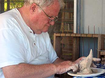
Our Wailua Mission is getting ready for Ganesha Chaturthi by making small clay Ganeshas. Here is Shaila Pushpa Sendan with her grandmother, Valli Sendan…
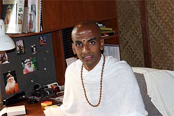
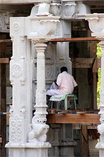
Brahmachari Rajadeva Alahan concentrated on his murthi making…
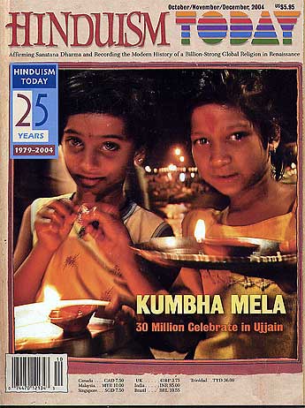
Hinduism Today Professional Critique
With Hinduism Today going up in the world and with Bodhinatha’s initiatives to bring a “rich media” experience to its readers… we had the magazine reviewed by a professional.
We hired Andrew Chapman, a top professional graphic designer/typographer in the industry, who lectures on high-end software and advises publishing groups, to give us an objective view of how we are doing. We asked him to be brutal, and to give us ten specific improvements we could make in the magazine, to enhance its professionalism. Here is his summary.
Aloha, Palaniswami!
My apologies for the lengthy time it’s taken for me to review your magazine. However, once you read what I have to say, hopefully you won’t mind the wait. Thank you for your patience.
Essentially, there is very little I can say with regard to improvements. Your magazine is fantastic! I’m very impressed with the level of quality and production that’s evident from page to page. It reminds me very much of US News & World Report and Newsweek in certain aspects of its look — I wouldn’t be surprised if you used those as models, and that was a good choice. It conveys top-notch professionalism and journalistic i
ntegrity. Here are my thoughts on the areas you requested feedback on in your cover letter:
1. Typography — Excellent choices. In my design seminars I always recommend a serif choice for body text and a sans serif choice for headlines and such. You’ve done both, and it makes for a very readable magazine. I have one typography comment below for your consideration. (I’ve consolidated my few critical comments below for easy reference.)
2. Layout — Very well organized and eye-pleasing, as well as eye-catching. The sections are very consistent within each issue, and from one issue to another. I know exactly where I am in the magazine, so the navigation is easy. I absolutely LOVE the contents being immediately on the inside fold — excellent choice. And then, the use of the three-page spread on the flip-side to further introduce the cover story is highly engaging and pulls me in. Great!
3. Photos — Again, fantastic choices. You’ve put together a beautiful collection of photography from issue to issue, with a very pleasant variety of sizes and colors and subjects. I have absolutely no critical comments regarding color correction, cropping, or choice. Also, the use of the stylized illustrations throughout, and especially in the cover-story sections, provides a nice textural balance to the photos.
4. Art — I just addressed the use of illustrations, but can continue that thought with regard to borders and other graphic elements. They tie the entire magazine together very well and support the theme perfectly. Your use of color does the same. While being a very colorful magazine, it doesn’t cross the fine line into looking like a “circus”. In my design seminars, I mention the potential for overusing color for color’s sake, and how it can take on the circus or carnival look if not applied properly. You’ve infused a generous dose of color throughout, without going too far. I also love the subtle textured background on all the pages, as opposed to the standard bright white look. Nice touch.
5. Branding comments — What you sent me ties together very well. It’s clear that each and every component or piece originated from the same organization. I have one minor comment below that falls into the realm of branding.
6. Ad layouts — Both the display and classified ads look good. I especially like that they’re all at the end of the magazine, and not interrupting the editorial content. I also like that you’ve got the display ads separated by alleys to allow the textured page background to show between the ads. And the use of the ragged border around some of them is a nice relief from the hard-edged ads. The “Custom Tours to India” ad on page 77 of the September 2004 issue is a perfect example of subtly breaking out of the inherent boxy nature of print layout, by using the ragged border and having the country’s eastern edge escape the ad.
7. Insight sections — My positive comments from above are simply echoed here in these sections. I like that they are oversized inserts/pull-outs, so they can function as stand-alone pieces. Well done. I only have one additional comment below.
8. Ten immediate improvements — Well, considering I couldn’t even come up with ten improvements in my comments below, I don’t have ten to offer! And my critical comments are hardly “must do” items. They’re simply for your consideration. There isn’t anything in your magazine that screams for instant fixing.
So, all that being said, here are the few things for you to think about. Again, these are very picky items (except perhaps the last one) that in no way detract greatly from an otherwise outstanding magazine.
* From a branding and readability standpoint, I’d think about using your serif body text choice from the magazine in the Insight sections as well. Generally speaking, sans serif typefaces are harder to read than serif in large amounts of text. The type choice is not bad, per se, but something to think about for these reasons. It could be argued, however, that you made this choice specifically to create a subtle uniqueness for the Insight sections vs. the magazine. If so, I can understand that.
* It’s far more common for the back cover of a magazine to be ad space as opposed to editorial space. Given the high level of professionalism otherwise, I assume this to be a conscious choice, but wanted to mention it nonetheless. The back cover brings in top advertising dollars, so if money is a concern, perhaps consider going with an ad here and move Digital Dharma inside. The fact that you use the bottom space for mailing (although that’s typically done on the front cover) would be a selling point to advertisers; i.e., people *will* see the back cover.
* On the front cover, the comma after the months and before the year seems distracting to me. While style guides disagree as to whether the comma is needed when no date is indicated, from a purely visual standpoint it seems intrusive here.
* I’ve saved my most significant comment for last. What I found most detracting from the overall excellent quality of your magazine is the “Today” on the cover. (I sure hope this isn’t a beloved choice of yours!) At first, I wasn’t sure why it bothered me so much — then it hit me. The type choice and rainbow coloring of the word make me think of the late-1960s and 1970s! Look back to publications and posters and t-shirts of that era and you’ll see this look. Thus, what bothers me is that the word “Today” ironically looks outdated. So, if you see this as worthy of consideration (and there’s not some reason for this type choice that I’m overlooking), I’d change this font to something more contemporary and immediate. To find some worthy candidates, check into technology magazines and logos of technology companies. What you’ll find are simpler and clean fonts — they won’t create the stark contrast you now have (between “Hinduism” and “Today”) and that I assume you’re going for, but you’ll still have some contrast without the outdated look.
And there you have all I can say in the realm of “improvements”. As I predicated, they are mostly very minor, and certainly not crucial. Once again, the magazine is stellar — I hope you have, or will, submit it to design competitions. It’s certainly deserving of an award.
I hope my review will prove helpful. If nothing else, you have confirmation (at least in my opinion) that you’re doing just about everything “right”! Regarding your comment in the cover letter about being traditional but wanting to be interesting, I think that’s exactly what you’ve achieved.
Please confirm you’ve received this, and with your permission I’d like to donate the magazines you sent me to my local library instead of returning them. They don’t carry Hinduism Today, but hopefully they will after seeing it.
Sincerely,
Andrew Chapman
Publishing Consultant
www.achapman.com
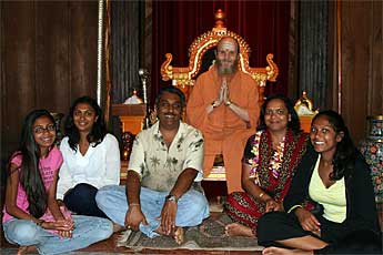
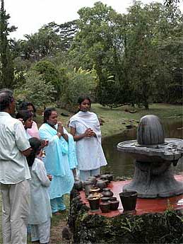
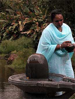
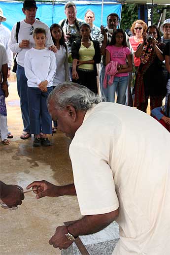
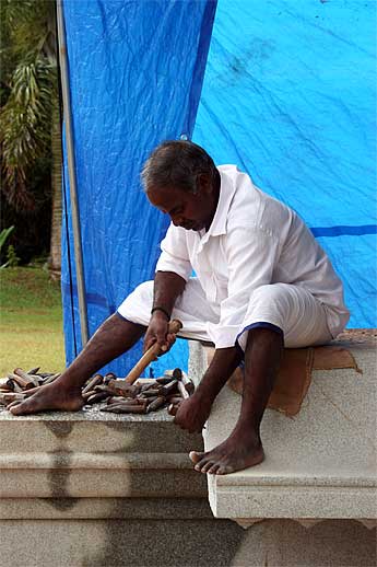
Guest Day Photo Album
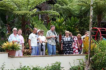
We will close today with pictures of our weekly visitors’ tour


From Our Gurus' Teachings
Archives are now available through 2001. Light colored days have no posts. 1998-2001 coming later.
